ヘルマン・ツァップ Hermann Zapf
私が1988年にタイプバンクに立ち寄って林隆男さんと日本語の字形について語り合った時、彼に筆で何か日本語を書いてくれないかと頼まれました。
私に筆で何か日本語を書いてほしいという依頼は、1982年と1988年の2回の日本訪問中にも度々ありましたが、私はその度にそれを断っていました。
というのも私の日本の手書き文字に対する敬意があまりにも大きかったからです。
タイプデザイナーであれば、どんな言語でも―例えそれがアラビア語やヘブライ語であっても―まねて書くことができます。しかし、日本の書道をまねようなどとはだれも思わないでしょう。
なぜならこの日本の美術の極みは、まず、その師に書き方を学ぶところから始める必要があるからです。師の情け容赦のない厳しい目に満足してもらうためには、場合によっては何年もの年月を費やさなくてはならないのです。
完全の域に達することは、ほとんどの人にとっては夢に過ぎないでしょう。
日本式に筆で書くことがなぜそんなに難しいか、理由はいくつかあるでしょう。まず第一に、筆を持つときの肘の位置や握り方がまったく欧米のそれとは異なります。
師が書いた手本のその絶対的なコントロールにはまったく敬服させられます。これは何世紀もの過程を経て完成されるものであり、今日でも高度な技術として守られているのです。
周知のように、美しい字形を習得するための訓練や、日本語の気質、字形の歴史、初心者にとって大変重要である堅固な流儀などを徹底的に学ぶことは、相当の集中力が必要なのです。
基本を学ぶためにヨーロッパ人に必要なのは根気と経験だけではなく、何度も何度も練習することです。第一段階が終わるころになっても、この魅惑的な書道のストロークの世界の表面にやっと触れることができた程度なのでしょう。
東京にあるタイプバンクのデザインスタジオを訪れた時、デザイナー達が見事なまでにアルファベットの視覚的な問題を習得していて驚きました。スタジオは暖かい雰囲気でした。
アメリカのデザインスタジオの様な慌ただしさや、雑然とした雰囲気は感じられませんでした。原字は慎重に制作されていました。
文字の一つ一つがそれぞれ完璧な形をしていて、ローマンのアルファベットでは大変重要になる文字同士の組み合わせなども注意深く考慮されていました。
この日を境に私は日本人の作成するローマンの文字デザインだけではなく、漢字に対しても特別な興味を覚えるようになりました。
タイプバンクのデザインスタジオで数々の例を見た後、出来る限りいろんなことを学ぶために情報が欲しいと考え、帰国するとすぐに漢字の構造について集中的な勉強を始めました。
出版物が2か国語で組まれ、漢字とローマ字とが隣り合わせになった時に、それぞれのスタイルや基本的な構造の違いを埋める解決法を見つけ出すため、色々な実験をしました。
タイプデザインを祝業とする私の興味は、漢字の形と黒味とをいかに均一に見せることができるかといった事に注がれました。もちろん、これは単なる実験に過ぎないのですが。
欧米の書籍用の書体の場合、文字の様々なストロークやエレメントの釣り合いを注意深く調整します。これは、欧米の書籍のタイポグラフィでは文章を組んだときに黒味が均等にとれていることを最終目的としているからです。
日本語での組版は、我々欧米のそれとは全く違います。林さんと私の論点は、漢字を一文字形成するのに使用されるストロークの数によって、文字の黒味がどう変わるのかということに集中しました。
林隆男さんと私は、「聞」のような黒味の強い文字を広げたり、「人」や「工」のような文字(例えば「人工」のように)を狭めたりするような馬鹿げた私のアイデアについて語り合いました。
私が考えたのは、デジタルで加工することによって黒味の異なる文字同士の釣り合いをとろうというものでした。しかし、この試みは複雑すぎて、正方形を基本とする基本とする漢字のシステムとかけ離れたものになってしまい、 失敗に終わりました。こうしたプロポーションの漢字というのはたとえ横組みには有効だったとしても縦書きでは役に立たなかったでしょう。
林隆男さんは、私が出す様々なアイデアをとても辛抱強く聞いてくれました。もちろん彼は新しい漢字タイプデザインに関わる様々な難点についてはよくご存じでした。
しかし、これらの実験、全ての問題や細部を通して私が漢字についてより深く理解できるようになったことを書き加えておこうと思います。
彼の突然の死は、私の研究に終わりを告げただけでなく、日本の大親友をなくしたことにもなりました。
(翻訳 窪田雄子)
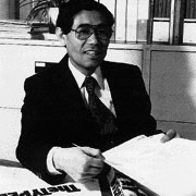
- タイプバンク創立者 林隆男 Takao Hayashi
-
武蔵野美術大学中退後、写植組版技術を習得しタイポグラファーとなる。
1962年、タイポスの制作、文字盤化と普及をグループ・タイポの一員として推進。1975年、株式会社タイプバンク設立。以来、タイプディレクターとして、水井正ナウシリーズ、味岡伸太郎かなシリーズのヒット作を次々と世の中に送り出す。
1980年、日立製作所デザイン研究所とビットマップフォントの共同開発を開始。後にタイプバンク制作の品質の高いビットマップフォントは、カシオ、京セラ、富士ゼロックスなど大手電子メーカーに多く採用される。
将来のデジタル社会、PDFなどによるドキュメント電子化をいち早く予見し、1988年より、タイプバンク明朝、ゴシック、丸ゴシックファミリーのアウトラインフォントの制作を始める。
また、フォントの普及を重んじる考えからアドビシステムズ、ライノタイプ・ヘル、エヌフォーメディア研究所などに積極的にライセンスし、これらフォントをリリースする。
傍ら、書体の著作権保護活動やデジタルタイプフェイスについての論文を多数発表、デジタルフォントのパイオニア的存在となる。1994年、タイプバンクカリグラゴシックRのディレクションを最後に、胃がんのため永眠、享年57。
